D2DCure
Introduction
This WSQ ’23, our team had the opportunity to contribute to the Design2Data (D2D) project. D2D, spearheaded by the innovative leadership of Dr. Justin B. Siegel at the Genome Center, focuses on the meticulous collection of high-quality kinetic and thermal stability data for previously unexplored mutant enzymes.
Timeframe
January — June 2024 | 16 weeks; Extended to Fall 2024
Tools
Design — Figma
Development — Next.js, Prisma, TypeScript, mySQL, Firebase, Python, AWS cloud storage, Vercel
Maintenance — Jira, Notion, Slack, Github
The Team
The Client
Design2Data is led by Dr. Justin B. Siegel and Ashley Vater, and includes forty faculty at institutions across the nation. D2D aims to make biotech research experiences accessible to tens of thousands of students who otherwise would not have the opportunity.

The research goal of D2D is to unravel the intricate relationship between protein structure and function for improved predictive tool development in the enzyme function space.
Our Task
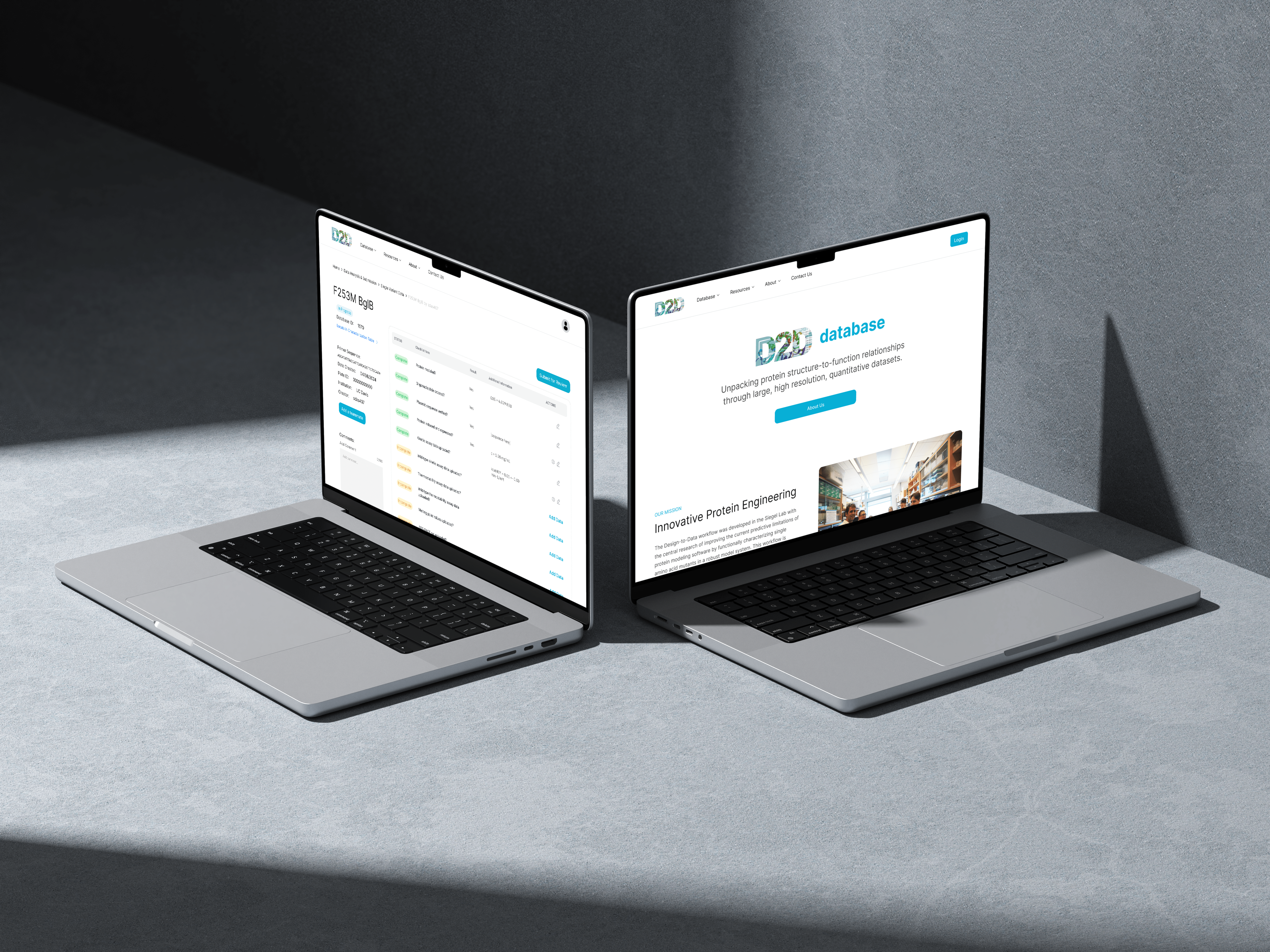
The Siegel Lab, in collaboration with over 40 institutions, relies on the D2DCure website for submitting, curating, and characterizing their enzymes. Built five years ago with outdated technologies, our main goal is to overhaul and modernize both the frontend and backend of the D2D website.
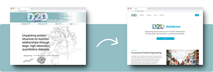
This will enhance user experience, streamline tasks, introduce new features, and provide a durable platform that will serve effectively for the next decade.

User Research
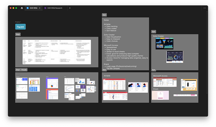
Our objective was to draw inspiration and gather insights by conducting a competitive analysis of companies specializing in data collection. The challenge was to identify the most effective practices from various companies and adapt them to our designs to meet our specific needs.
Additionally, we created a comprehensive information architecture for the current website to thoroughly understand its content structure. This process enabled us to evaluate the overall layout, identify strengths, and pinpoint areas for improvement. The D2D Cure website presented a significant challenge due to its complex information architecture, featuring multiple user flows, numerous pages, and scattered information. This was one of the most demanding aspects of the project, but it was crucial to streamline this architecture to ensure a seamless development process.
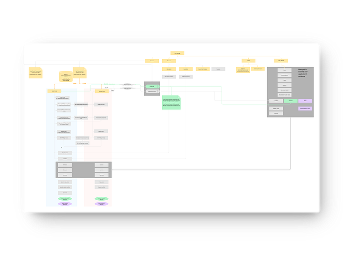
By tackling these challenges head-on, we aimed to provide a clear, well-organized framework that would significantly enhance the website’s usability and functionality, setting a solid foundation for future improvements and longevity.
Ideation
Following interviews with students and Ashley, our objective was to generate ideas aimed at addressing areas needing improvement. A key challenge was devising solutions that catered to everyone’s requirements. We conducted multiple ideation sessions and refined these concepts through weekly meetings. This iterative process along with our user-research yielded a range of design solutions that focused on the following main pain points.
Element Organization/Visualization: Best presentation for navigation and completing tasks
Clarity & Communication: Implementation of notification and tag systems
Forgiveness: Allowing researchers the ability to fix their mistakes
These outcomes were a result of collaborative effort and meticulous refinement, ensuring the solutions aligned closely with user expectations and project goals.
Low-Fidelity Wireframes
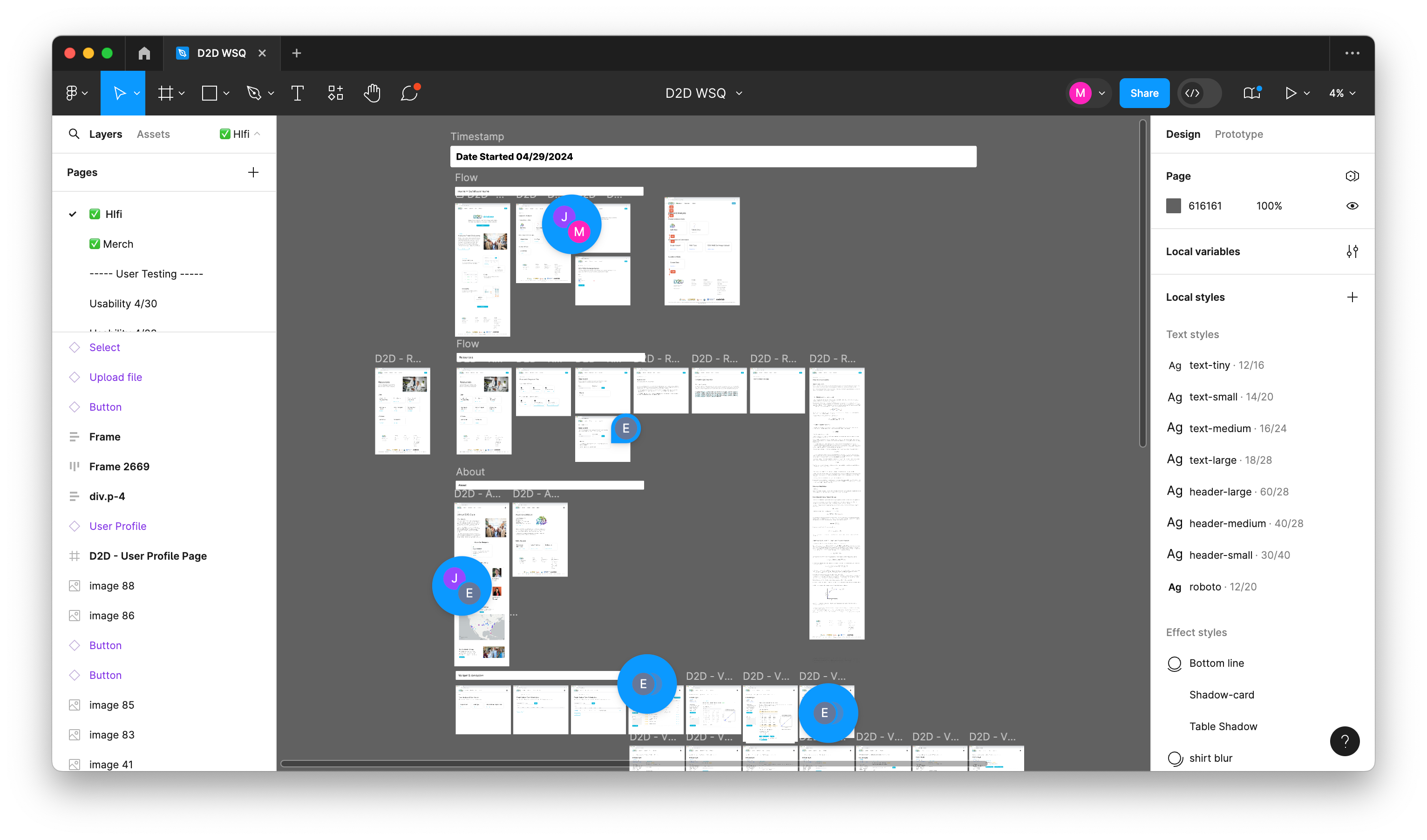
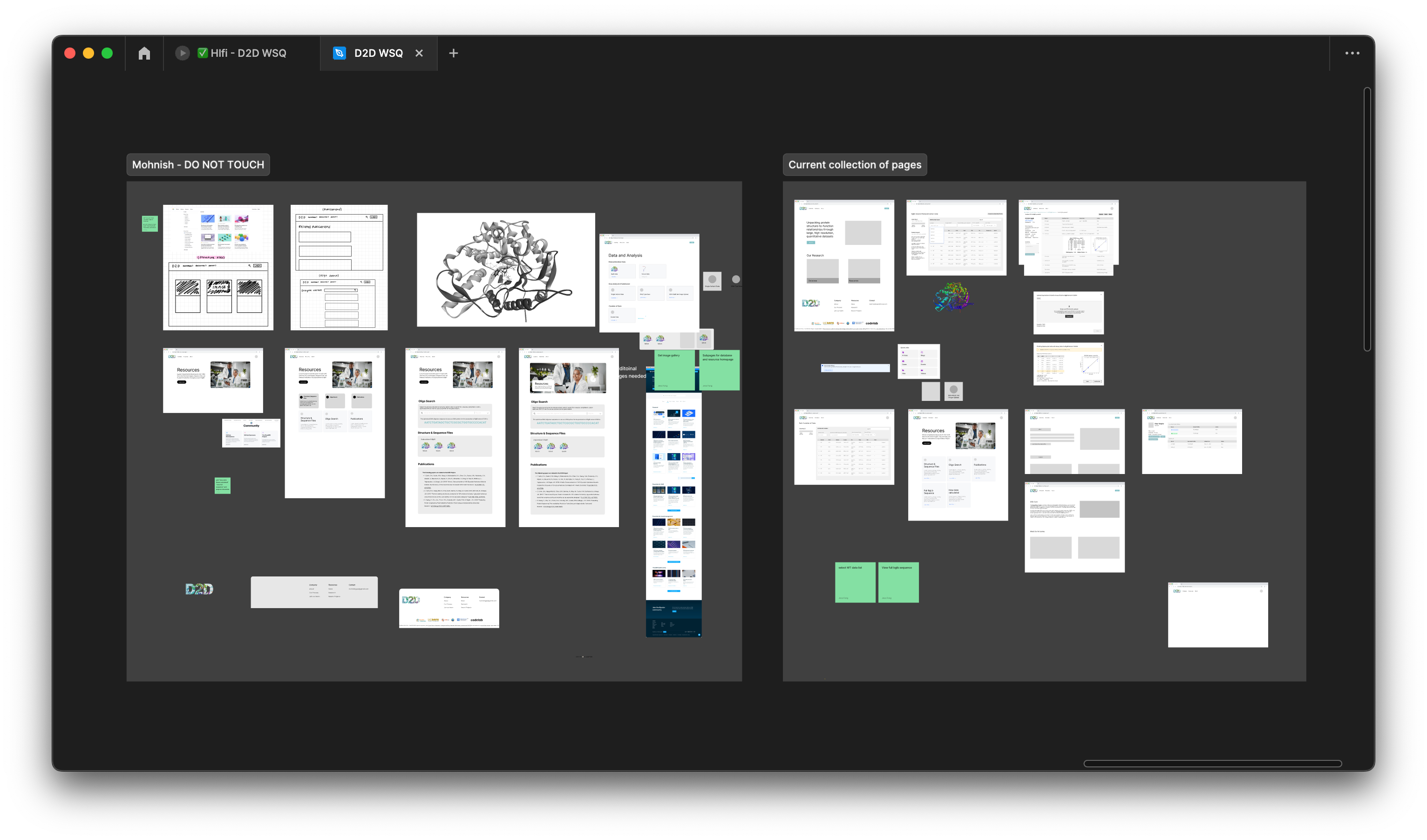
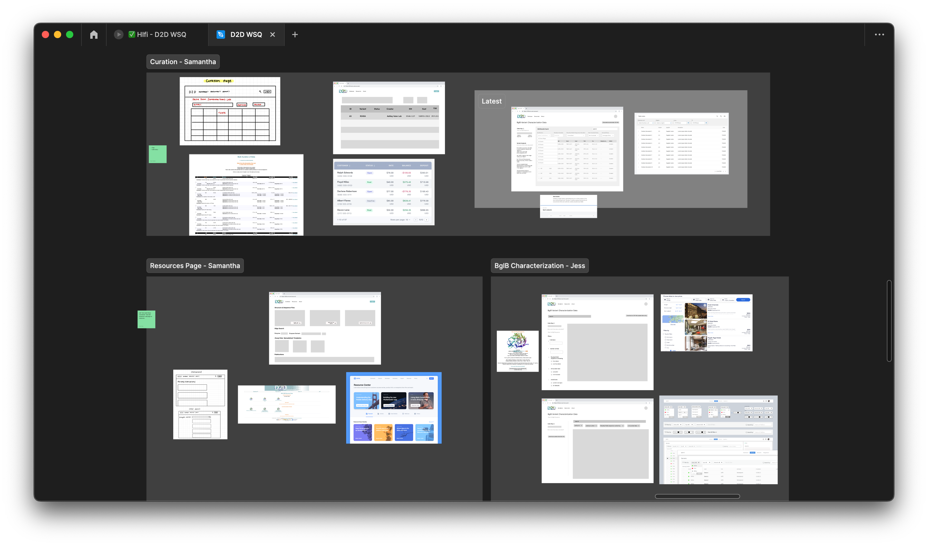
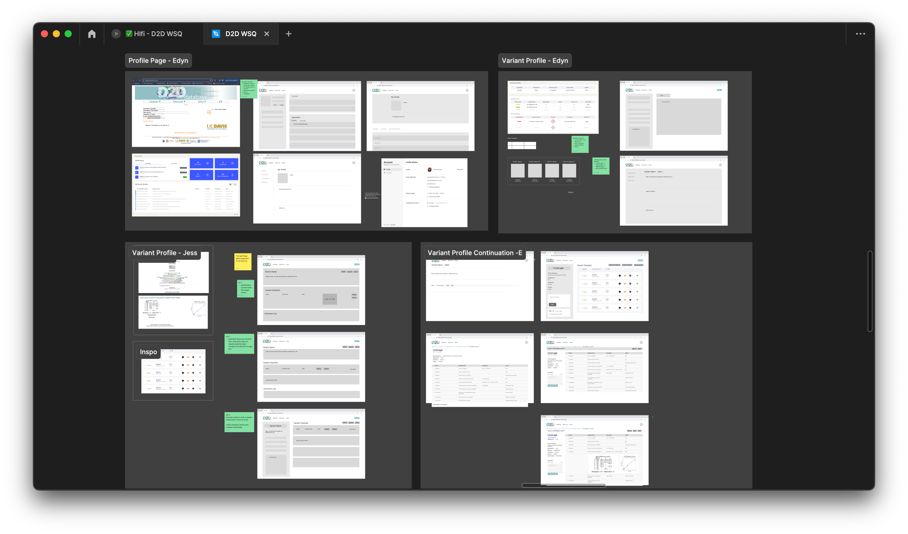
Our objective was to develop low-fidelity prototypes (Lofis) to bring our design ideas to life visually. A significant challenge we encountered was finding the optimal layout that not only met our users’ needs effectively but also ensured consistency and coherence across all pages. It was essential for us to maintain a uniform design to facilitate seamless navigation and enhance the overall user experience throughout the website.
Mid-Fidelity Wireframes
For the mid-fidelity phase, we focused on integrating the site’s functionalities with an optimized layout and establishing how data information would be visually stored. This involved our cross-functional collaboration with the developers to determine the most logical and efficient solutions for both our users and the backend of the website.
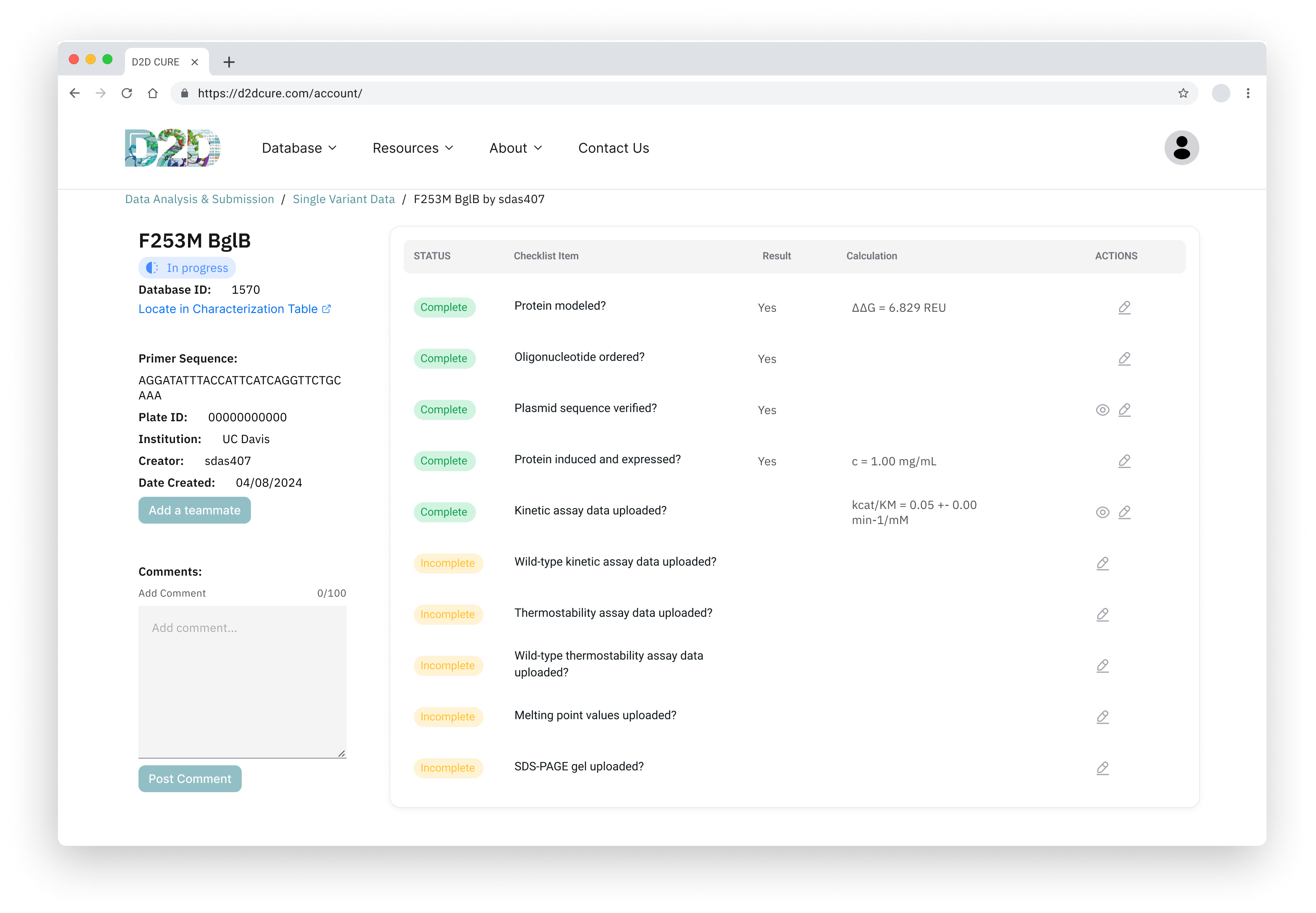
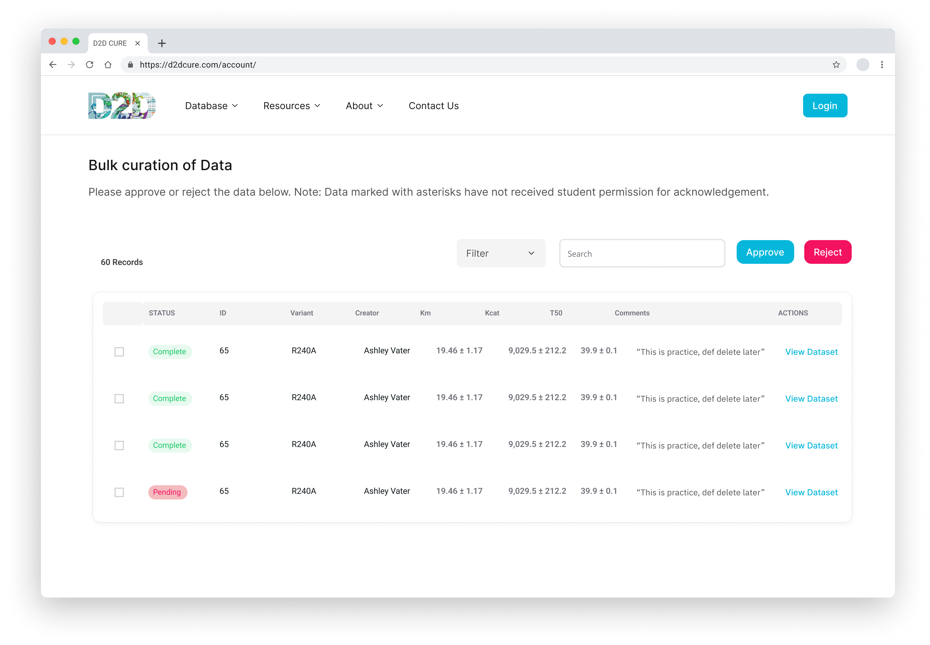

Consistency between pages was a priority to ensure users could easily understand functionalities, so we implemented design patterns such as organizing subpages within a database on each main page. Additionally, a notification system and status tags were implemented to enhance user experience by keeping users informed.
User-Testing
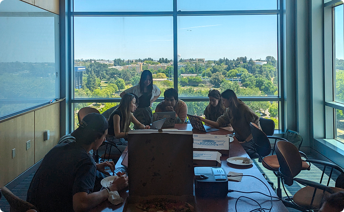
To determine if research students could navigate and comprehend each element of the new website, we conducted individual and group user testing sessions. The testing was very successful, yielding valuable feedback and suggestions from students. While not all suggestions were feasible, several changes were made, including resizing data tables, adding more resources to the resource page, and reducing the notification system to just emails based on user feedback.
High-Fidelity Prototype
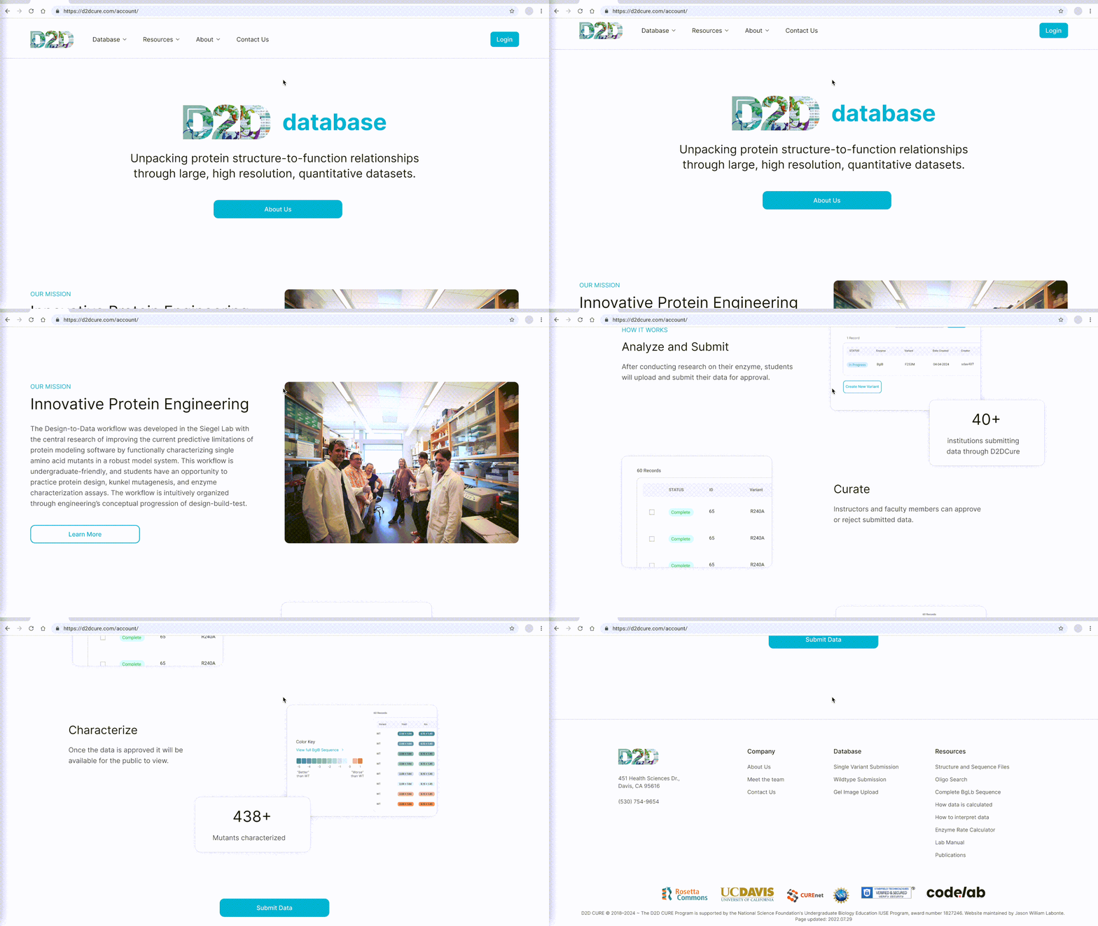
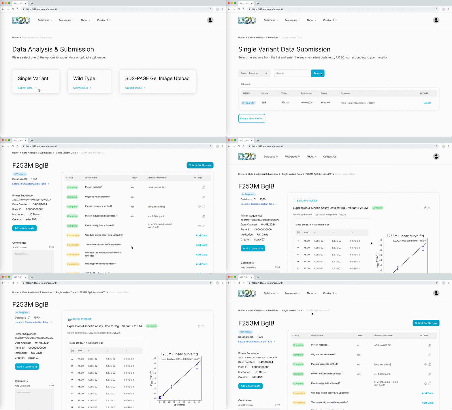
During the high-fidelity phase, designs were refined with user suggestions in mind, ensuring consistency across the design system. The filter system was improved to better meet user needs and touchpoint sizing was corrected to meet accessibility standards. Additionally, we made annotations on our design and components to facilitate a smooth handoff and implementation of the final designs.
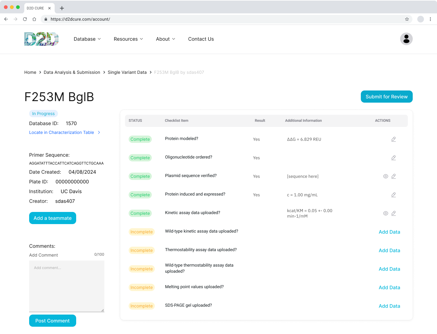
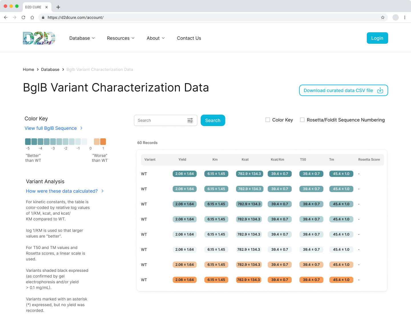

Design System
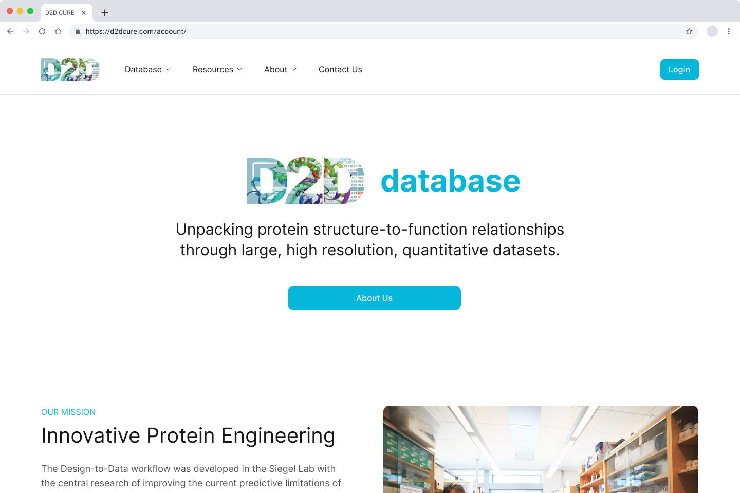
Our main goal was to enhance the UI by creating a more modern aesthetic to improve user-experience while preserving the core functionalities of the application.
We incorporated subtle drop shadows and rounded elements to establish a contemporary visual identity using components from NextUI to speed up the design and development process. Additionally, adhering to the D2D color scheme, we brightened the primary blue to create a more vibrant interface that emphasizes key interactions throughout the site.


BglB Characterization Page
One of our primary tasks was to redesign and update the main BglB Characterization Data page. This involved migrating existing PHP code and functionalities to React/TypeScript. Key features included fetching data for all variants and presenting them in a table format, with capabilities for filtering by Rosetta numbering, curated data, and institution. Users were also able to navigate directly to specific rows, and we implemented color coding for table cells.
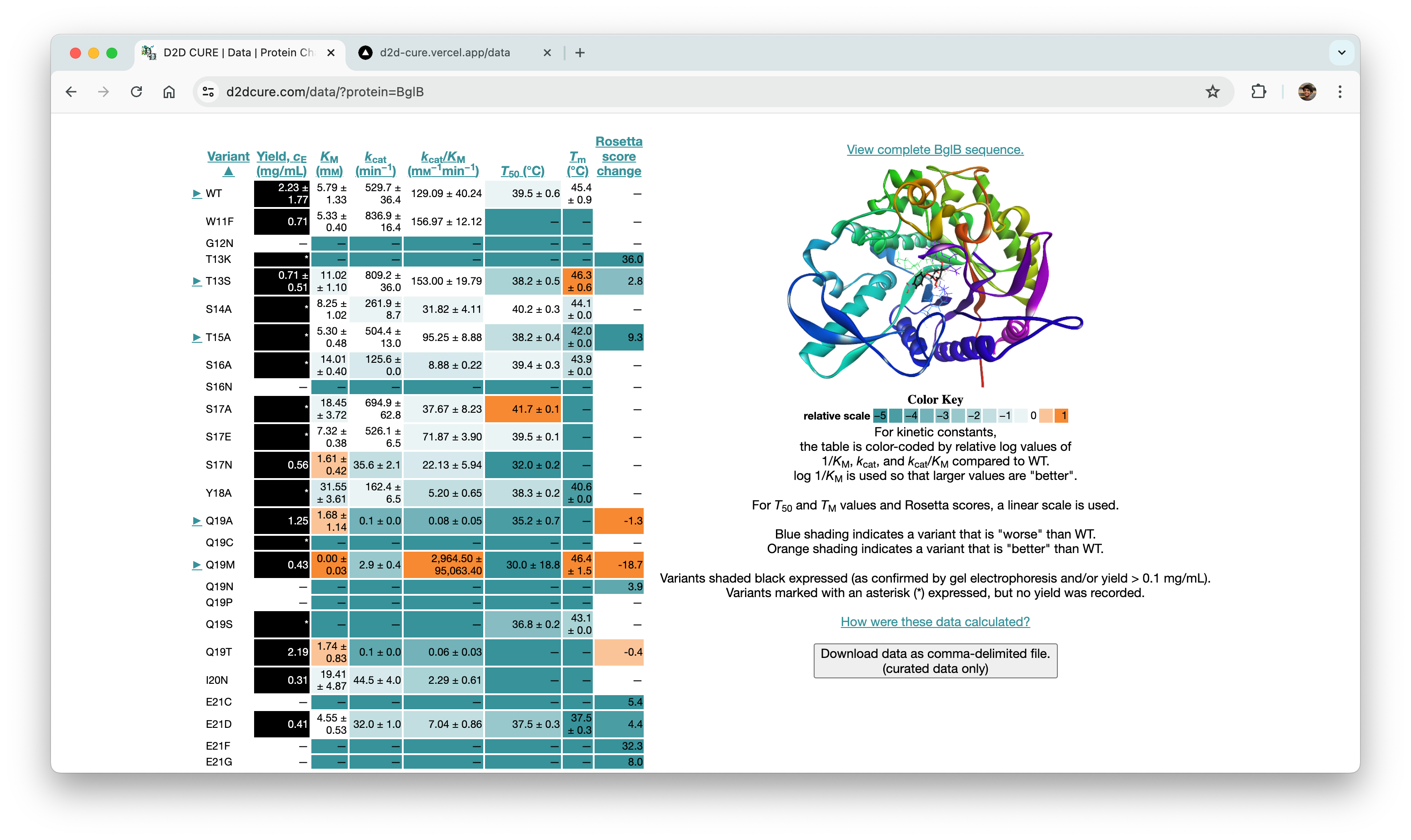

Our approach aimed at enhancing performance was notable. Initially, applying a filter in the old system triggered a reload of the entire page with the filter as a query parameter. In contrast, our revamped approach involved fetching all data during the initial load and applying filters client-side. Although this increased the initial load time slightly, it significantly improved user experience by enabling instant application of subsequent filters without needing to reload data or the page.
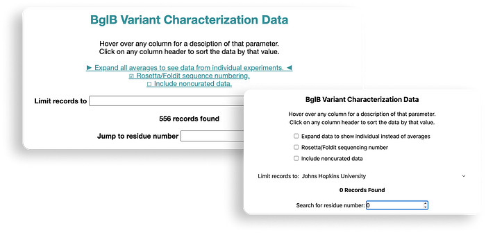
One significant challenge we encountered was implementing column sorting functionality. Originally, users could sort each column in ascending or descending order by triggering data refetching with sorting criteria as a query parameter. Replicating this server-side posed difficulties, leading us to opt for a client-side approach for sorting as well. By adding a few lines of code to manage sorting criteria during table rendering, we successfully integrated this feature into the application.
Data Submission Pages
Another pivotal task was to revamp and optimize the data submission process for both single variant and wild type submissions. This required translating PHP functionalities, such as kinetic assay data, melting points, and protein expression checklists, into TypeScript. Our aim was to uphold the original application’s functionality and enhance its performance.
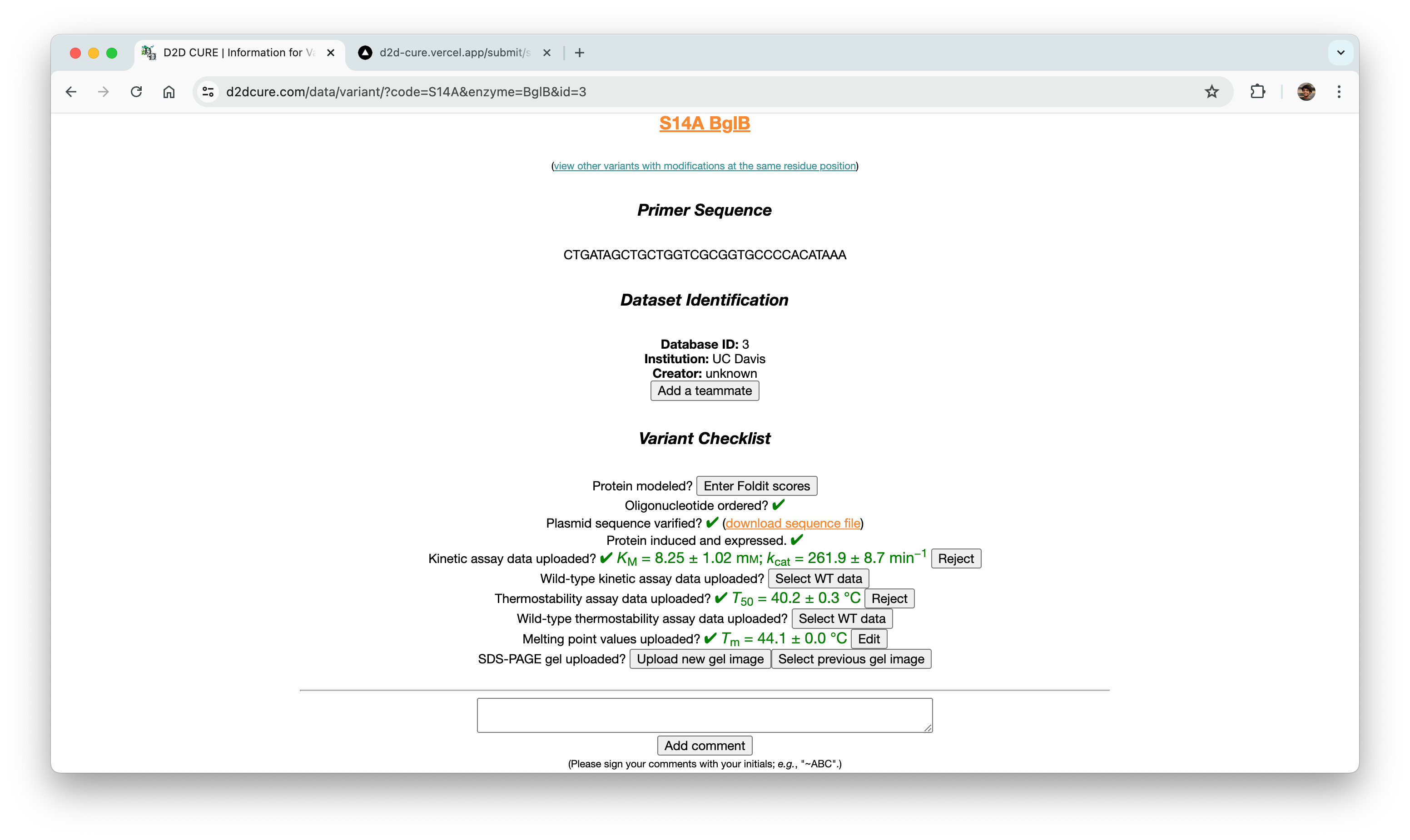
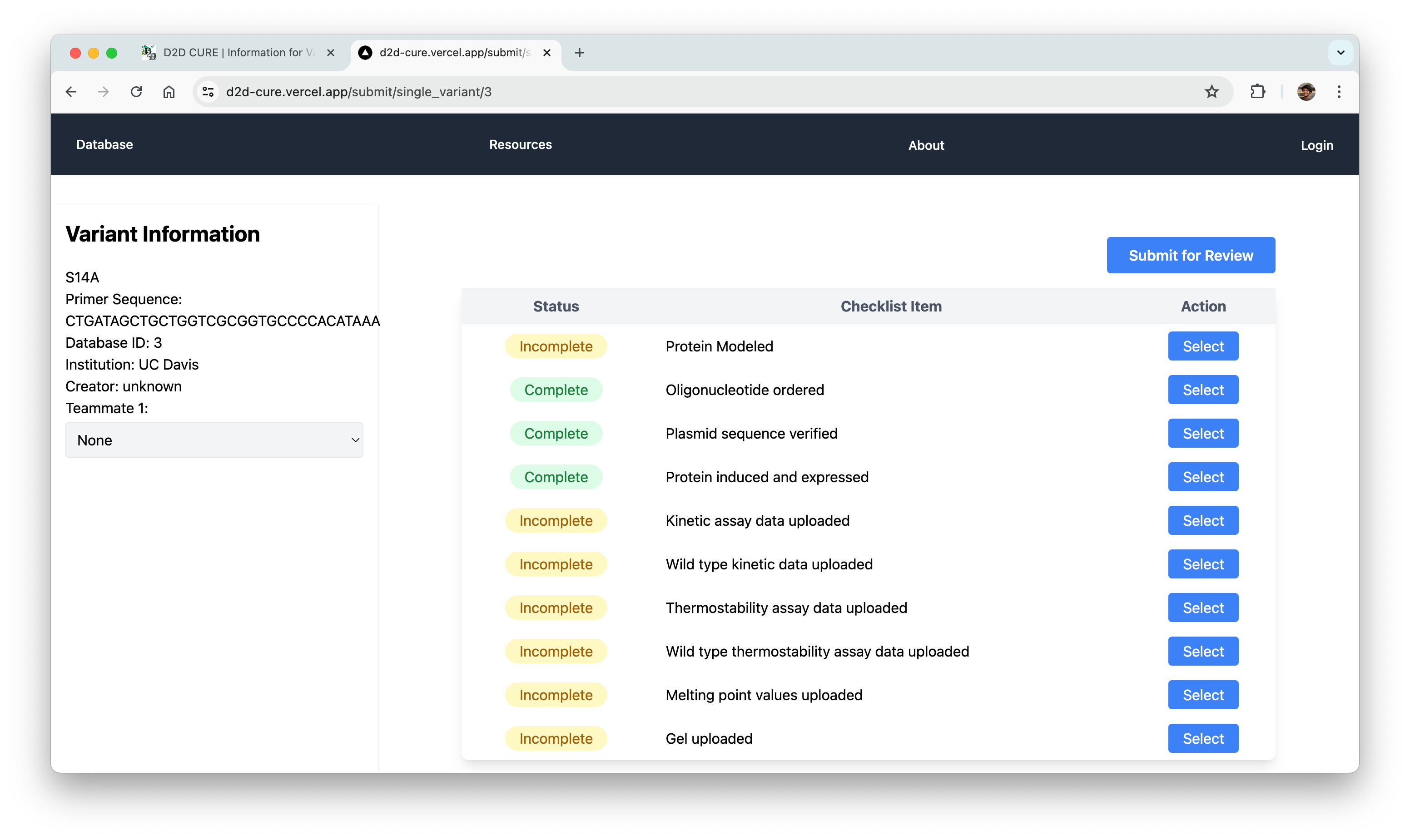
One notable challenge we encountered was managing file storage, particularly for CSV files containing data and PNG images of graphs. In the previous setup, files were locally stored within the codebase and managed via GoDaddy for uploading, storing, and retrieval. However, transitioning to Vercel for hosting necessitated a different approach to file storage.

After thorough evaluation, we opted to leverage AWS S3 buckets. This decision was based on several factors including ease of setup, flexible pricing models, and our existing utilization of AWS for hosting our MySQL database. By integrating AWS S3, we not only resolved our immediate file storage requirements but also ensured a scalable solution aligned with future development needs.
Curation Process
In a parallel effort, we recreated the curation pages by migrating functionality from PHP to our React application. This included reconstructing the two-step approval process for database entries at both the professor and admin levels. We seamlessly integrated this logic with our new Firebase authentication system to offer distinct views based on user roles.
Similar to our approach with the BglB Characterization Page, we optimized performance by fetching all data at once, eliminating excessive database calls and page reloads. Previously, switching between admin and professor views would trigger a page reload and data refetch. With our implementation, this transition became much smoother and instantaneous.
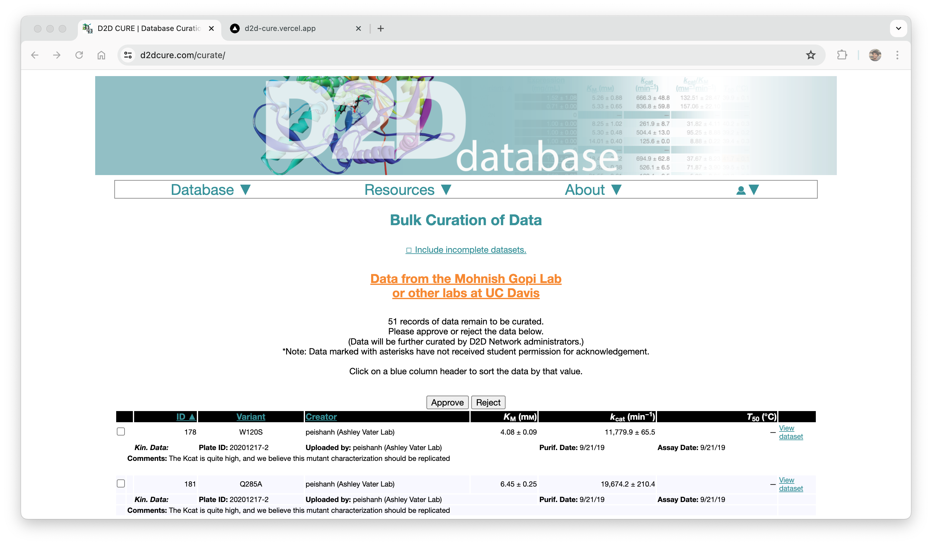
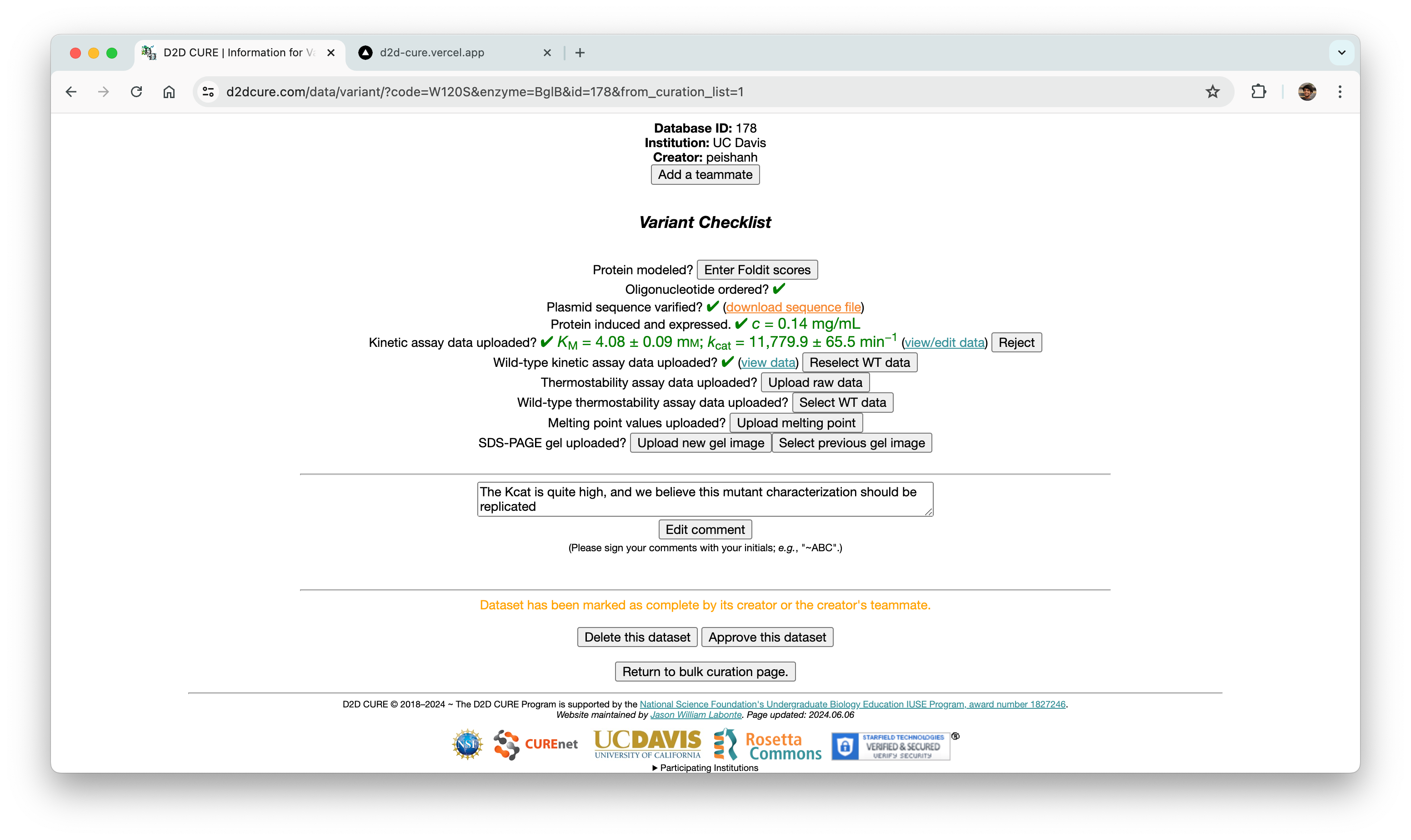
Our primary challenge centered around ensuring the accuracy of the two-step approval flow, ensuring consistency between the page interface and the underlying database operations. Through meticulous testing and refinement, we successfully replicated this functionality.
Looking ahead, our focus shifts to implementing the new designs and integrating them with the updated backend logic, ensuring a cohesive and efficient user experience across the platform.
Rendering Graphs & Tables
We also had to migrate the graphing functionality from the old PHP-based site, which relied on Python scripts for generating graphs. A significant challenge we faced was the integration of these Python scripts into our new React frontend environment.
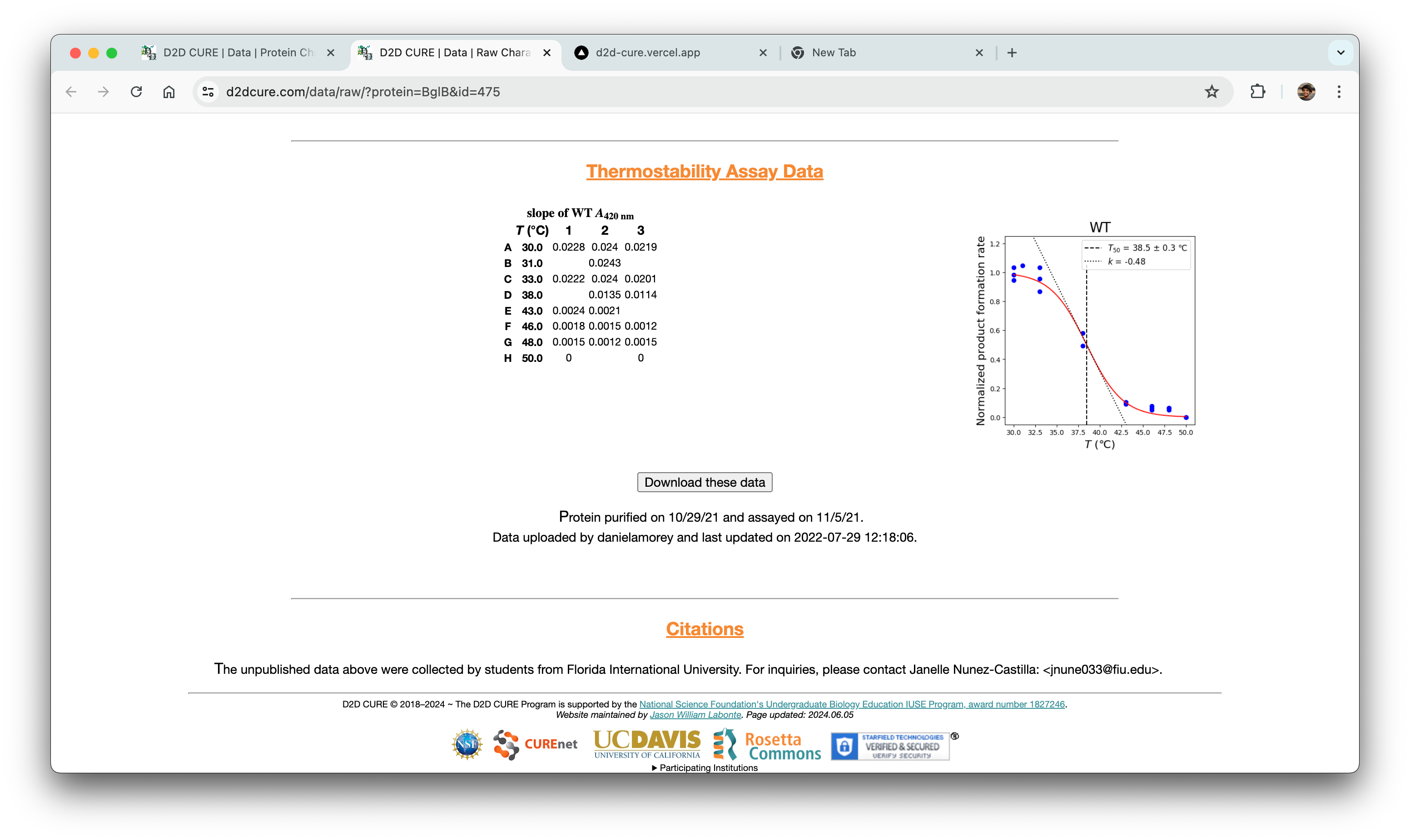
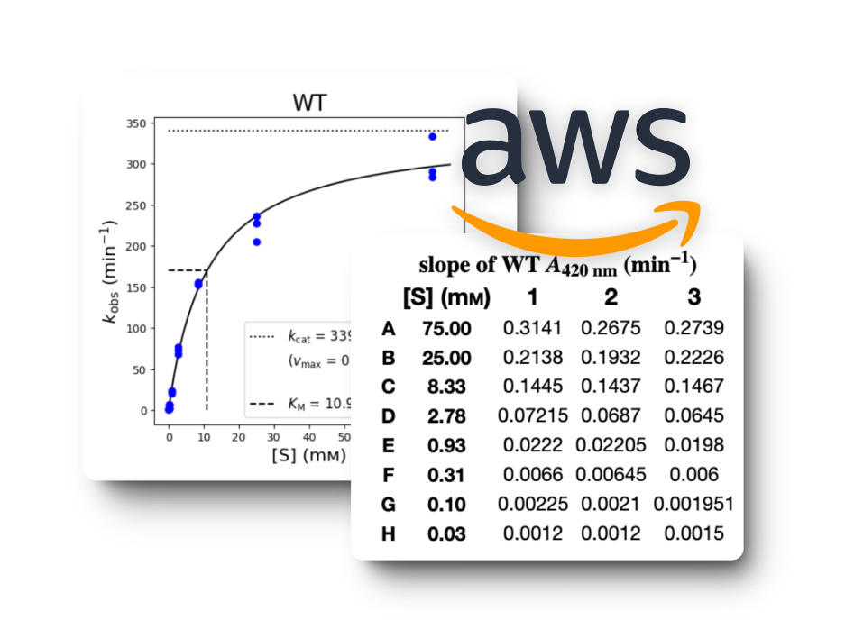
To address this challenge, we implemented a solution where we hosted the Python scripts on a Flask server. This Flask server acted as a backend service that could handle requests from our React frontend. This approach allowed us to maintain the existing graphing logic while seamlessly integrating it into our new technology stack. We also used AWS S3 cloud storage for rendering graphs because of its scalability and reliability compared to local storage solutions.
In addition to the graphing functionality, there was a need to fetch the data associated with a single variant and display it alongside the graphs. Since most of the other APIs built fetched the entire dataset, a new API that fetched only a single variant’s data was made to support this functionality. The retrieved data is then parsed using string parsing techniques, and then stored for later processing.
Gel Image Uploads

We later had to migrate gel image uploads from the old site, which presented challenges related to storage and organization of these files. To address this, we opted to store the images on AWS and organize them directly within the file names using metadata as (2024–04–11_yourUsername_GELID.png) This approach proved effective and efficient.
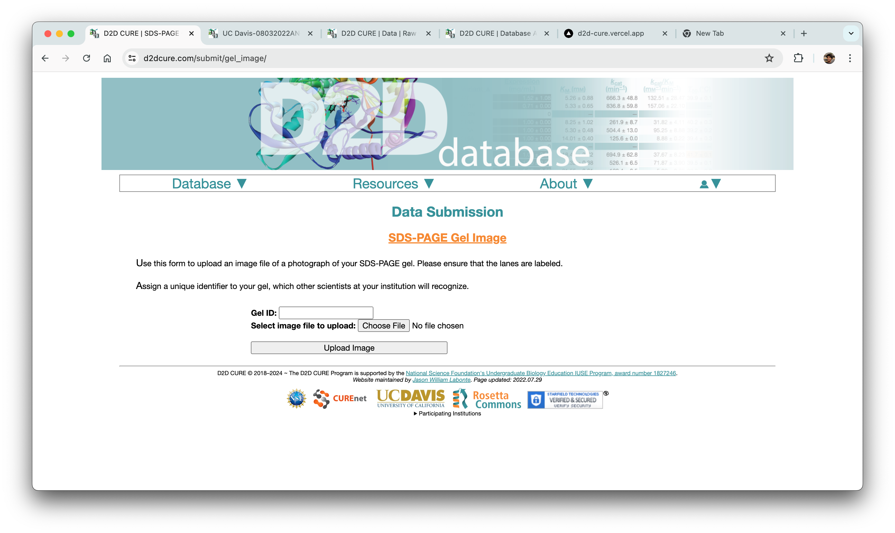
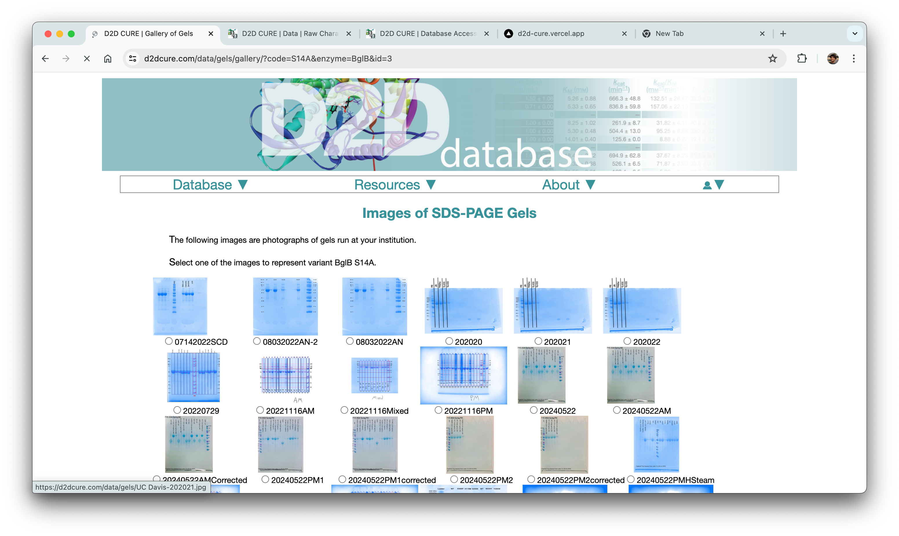
A significant takeaway from this experience was the realization that sometimes the simplest method, such as embedding metadata directly into file names, can be the most efficient solution. By structuring the file names with relevant metadata, we streamlined the organization and categorization process without the need for complex additional systems or databases.
Minor Front-end Builds
Parallelly, we also had to overhaul the website’s frontend to precisely align with the design team’s vision. This posed challenges, not only in meticulously translating the frontend to match exact specifications but also in mastering the new NextUI framework.

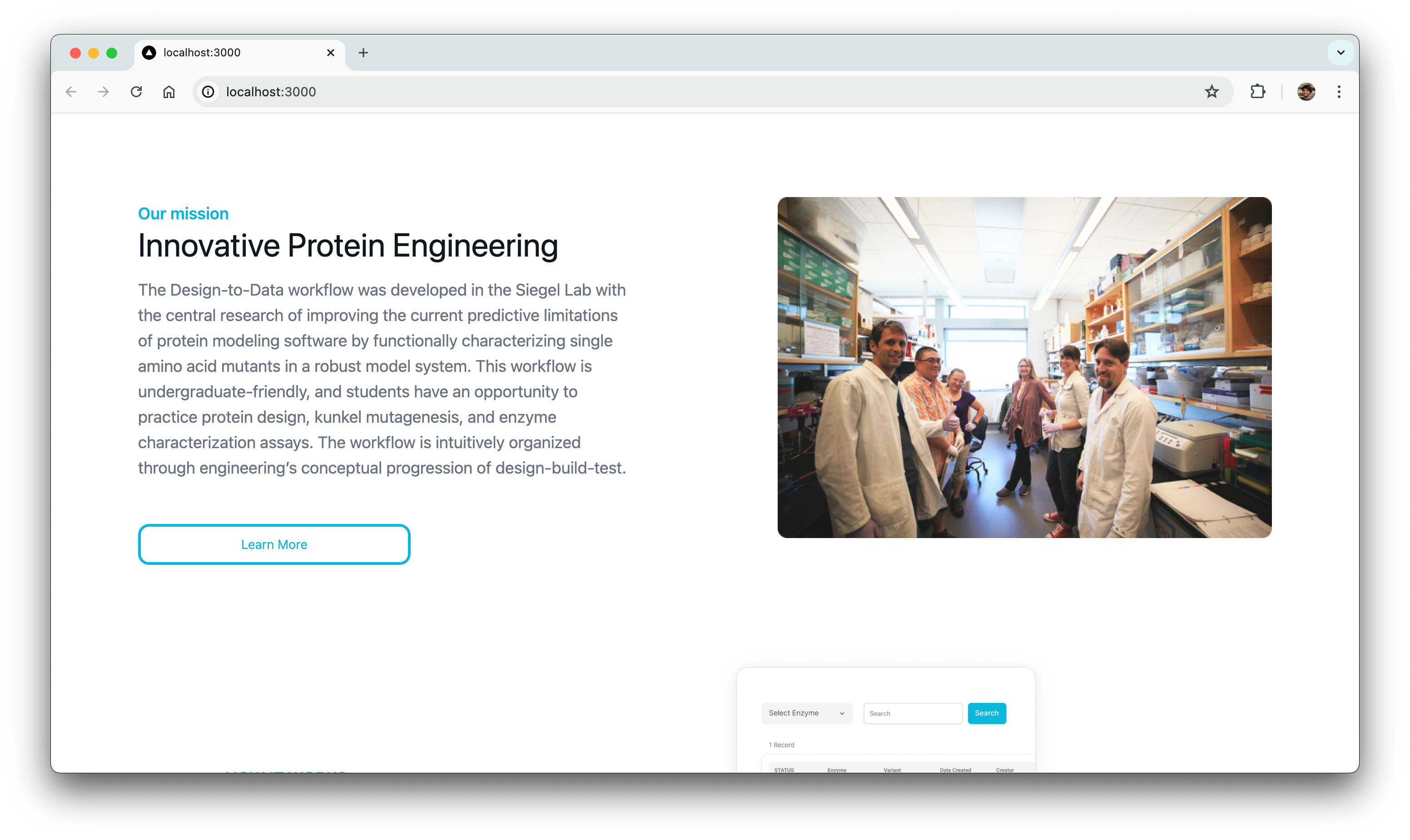
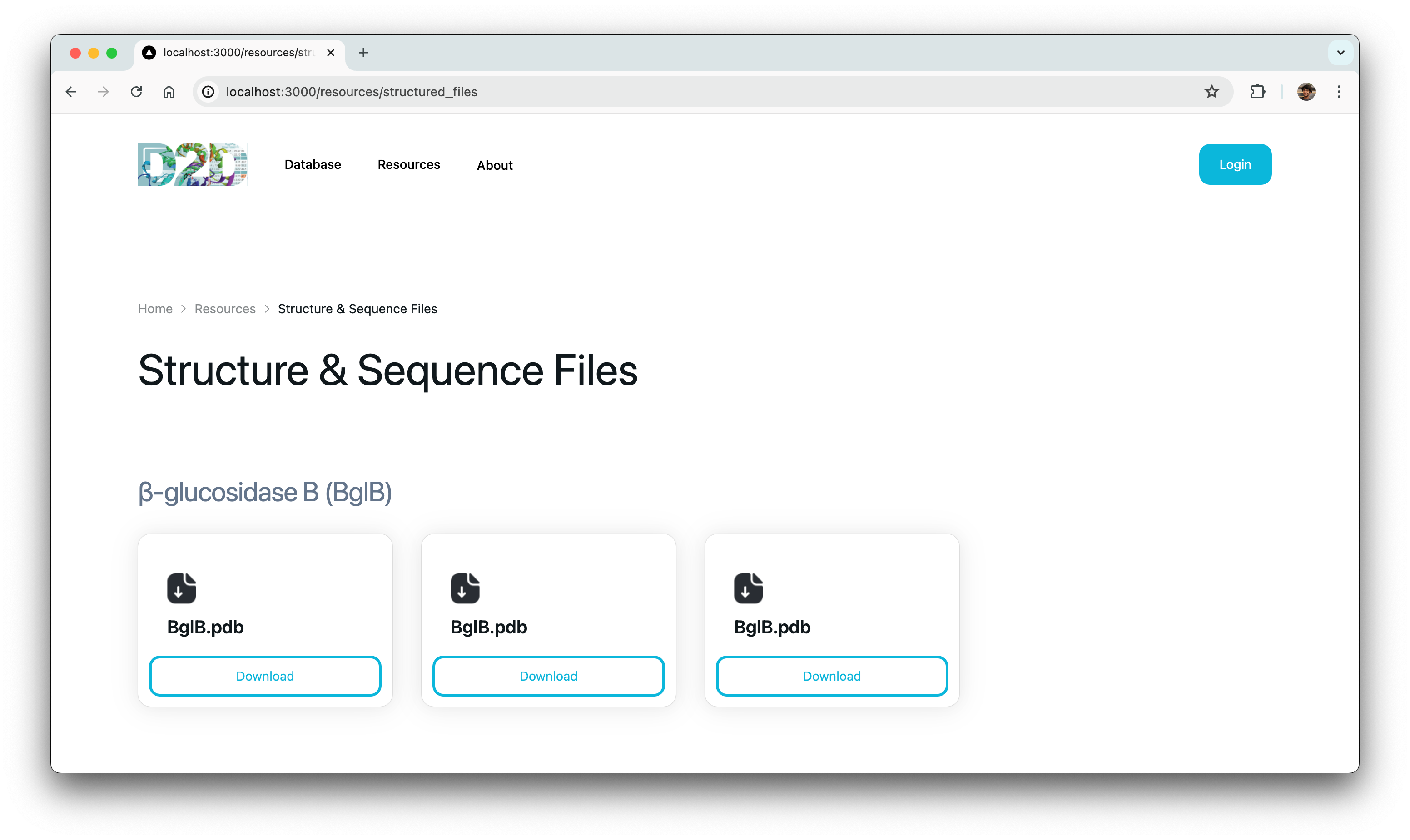
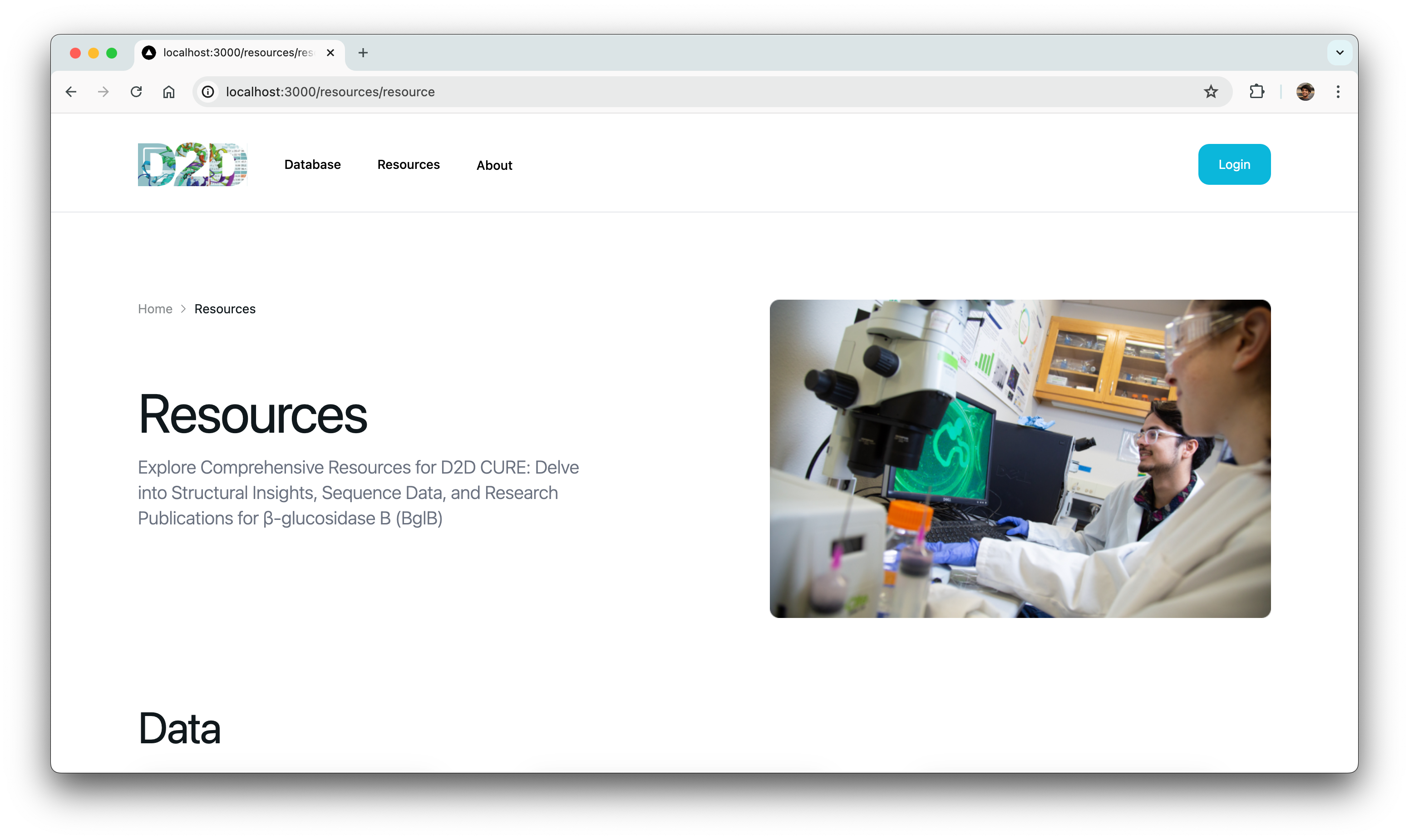
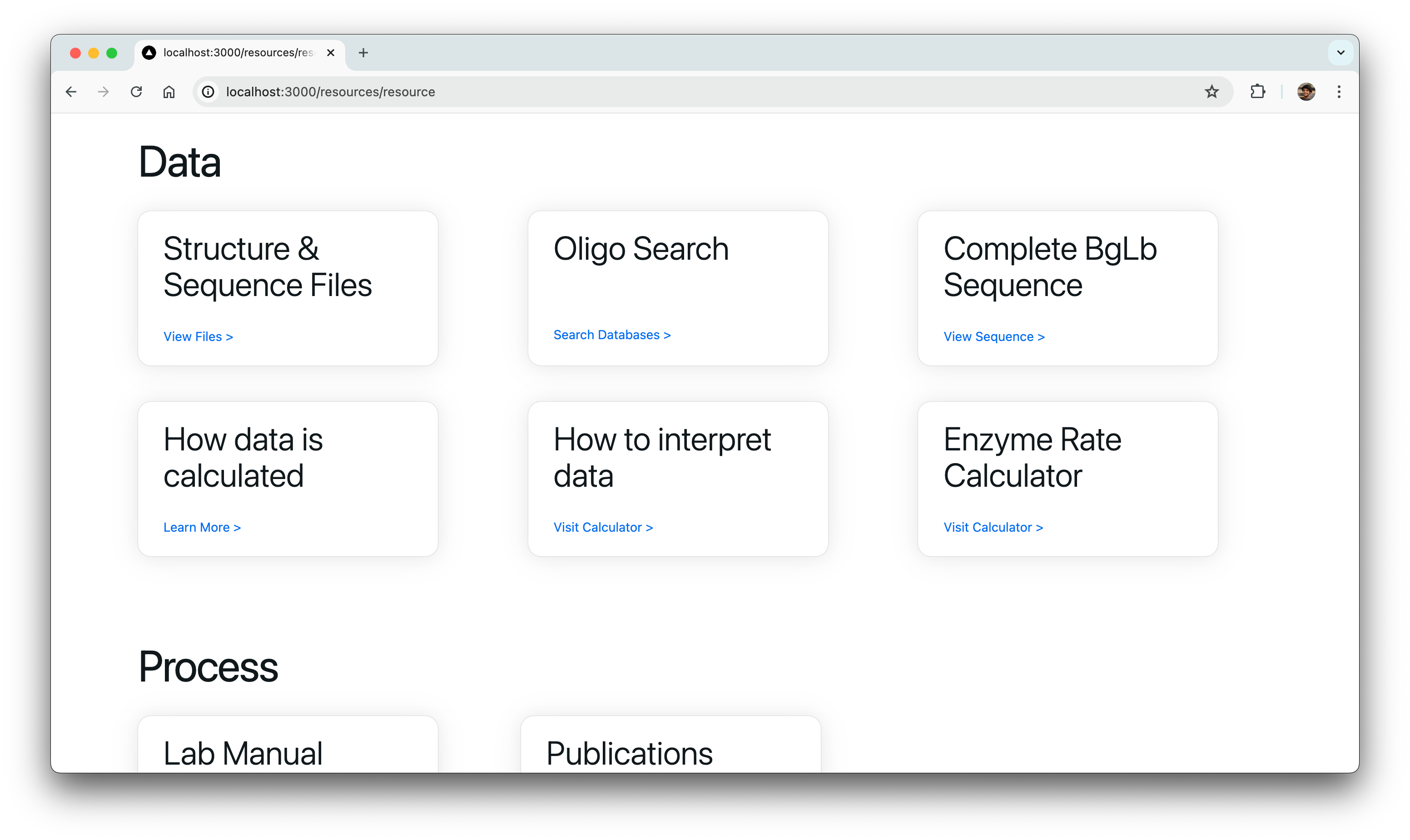
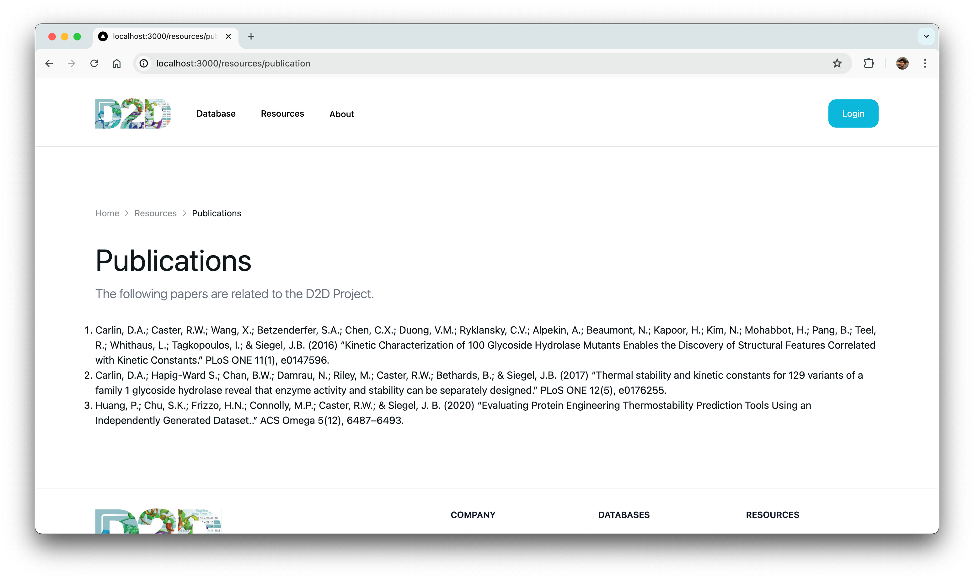
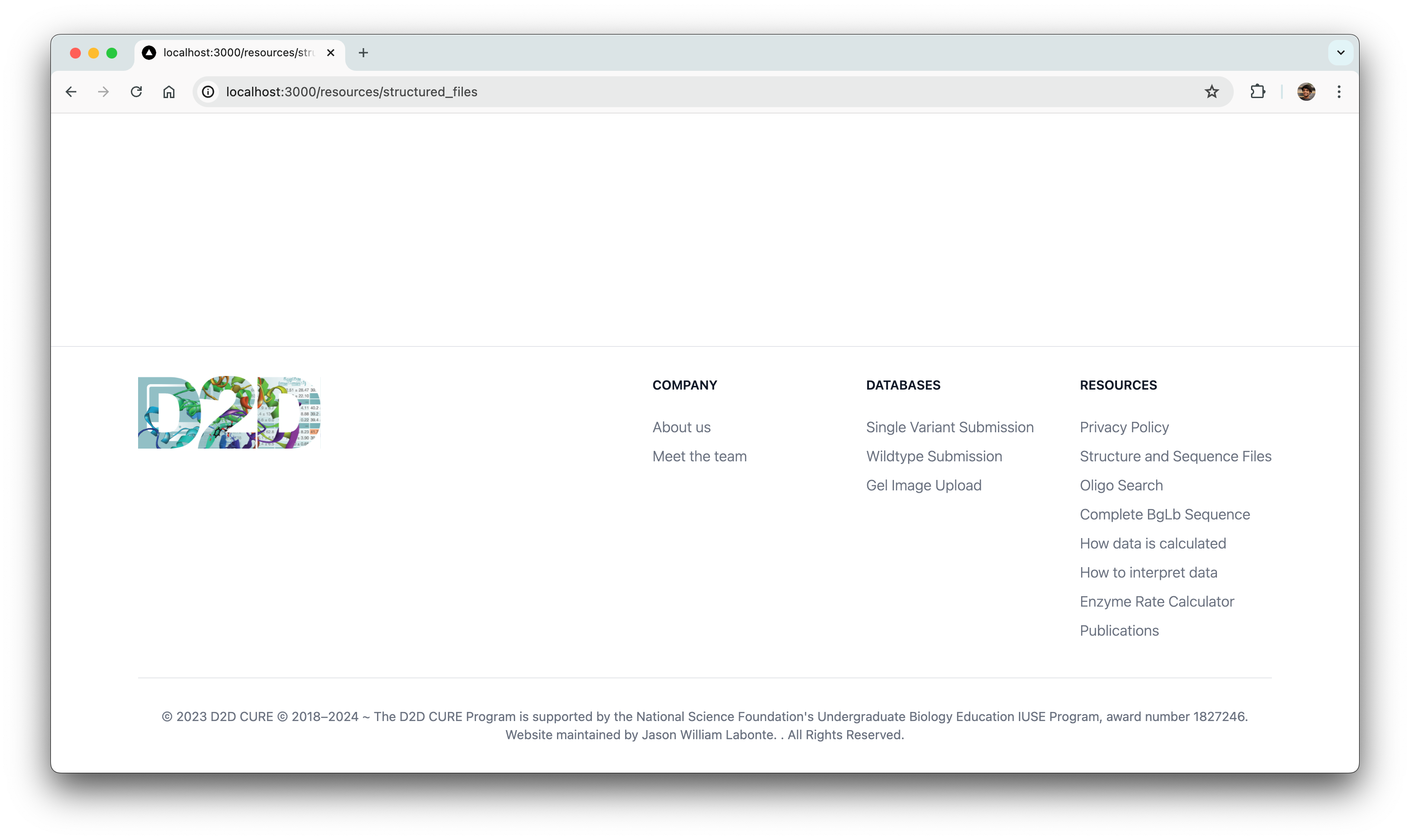

Initially, grappling with setting up and becoming proficient in the NextUI framework appeared daunting. However, we tackled this by thoroughly reviewing documentation and leveraging community resources to navigate the learning curve effectively.
Ultimately, we successfully translated approximately 25% of the frontend designs provided by the designers with 100% fidelity to their original specifications.
Next steps
This isn’t the end of D2D x CodeLab! We are thrilled to be able to extend this project into Fall 2024 to continue our progress and get the application ready for launch around the end of the year. We will continue our design dev handoff and the implementation of the remaining frontend, additional features, and client requirements. Some of which include…
- Enhanced error detection and proactive suggestions
- Optimization of responsiveness and efficiency
- Integration of release versions into our Git workflows
- Efficient management of merging processes across 20+ branches
Challenges
Timeline
For such a large scale project, one of our main struggle was planning out our timeline. We tackled this by approaching our project in three stages: First was gaining a thorough understanding of the project brief and the lab, next was rebuilding the website in the new codebase, and lastly was implementing additional features based on our user-research. While we’ve made substantial progress, we are taking extra time as mentioned to further flesh out new features and the overall frontend design.
Understanding Complex Concepts
A large hurdle of this project was the specialized and complex nature of our client’s work. Before we could dive into the development or design, we first had to understand the background of their enzyme research and how they use the website to submit their data. Once we accomplished this, it made the existing code easier to understand and rebuild, and it clarified the areas for improvement for design and product features.
Prioritizing Features
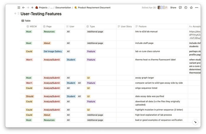
While our user-interviews were extremely valuable to understand our users, we had to distinguish what suggestions were absolutely necessary vs nice-to-haves. Creating a product requirements document allowed us to categorize features by lowest and highest priority, and ensured we had a defined end goal that was realistic for our short timeline.
Closing Remarks ✨
We would like to give a special thank you to Ashley Vater from the Siegel Lab for being an amazing client and working with us this year. We are looking forward to continue our partnership and be able to contribute to an application that will be used by lab faculty and students across 40+ institutions. Stay tuned for the Fall where we plan beta test with the Lab’s next wave of submission and prepare for our final launch!

